It must be said that some people gave us crap for this story ... but we were right:
I mean, apparently, we were right. Amazon changed it:
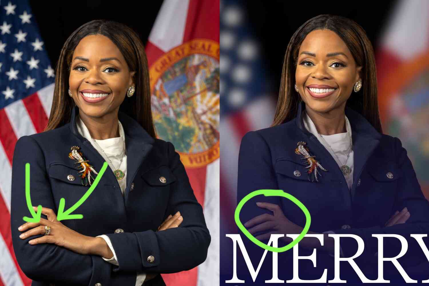
They shaved the stray hairs at the bottom of the stache and flipped the corner up to make it look more like tape. Probably a good move, if you ask me lol.
Everyone gets it wrong sometimes. Even the biggest company on earth with unlimited resources at their disposal 😭